
FitNow
One subscription, 250+ studios – and two people in a hundred ever reached a workout. This is the rebuild of everything in between.

Overview
FitNow connects people with 250+ studios and fitness clubs through a single subscription – gyms, group classes and personal training, all booked from one app and paid out of one balance of points.
The catalogue worked. The path to the first workout did not. The client came with one number – raise Install → First Booking conversion from 2% to 15% – and the whole activation funnel to rebuild.
The work ran as a full product cycle: client brief, 13 in-depth interviews, a behavioural segmentation, nine hypotheses scored with ICE, three of them designed out into a clickable prototype, and five moderated usability sessions on top of it.
- Client
- FitNow
- Role
- Product design, research, prototype
- Team
- Six people, Team №1
- Context
- Projector course, client brief
- Year
- 2026
The problem
Two people in a hundred reached a booking.
The biggest drop-off happened after people had already seen the schedules – the gap sat between finding a relevant session and committing to it.
That makes it an activation problem, not a retention one. If nobody reaches the first transaction, the cost of acquiring them is never earned back – every marketing hryvnia is spent on people who never see what they paid for.
Understand why people explore but do not book, then redesign the first-booking journey around the things that actually decide it.
Raise Install → First Booking conversion from 2% towards 15% – without adding a single new feature to the catalogue.
Process
Research first, then validation. Nothing on this page was designed on an opinion.
Discover
Client interview
Research plan
13 in-depth interviews
Define
Behavioural segmentation
Problem framing
9 hypotheses
ICE prioritisation
Develop
3 priority hypotheses
Design iterations
Clickable prototype
Deliver
5 usability sessions
Design iterations
Final screens
Research
Thirteen interviews, three kinds of club.
What we needed to learn
- How people choose where and what to train
- Which criteria actually influence that decision
- How they discover training options in the first place
- What they need to know before they book
- What stops them from going through with it
From assumption to behaviour
We started where everyone starts – segmenting by where people train. The interviews broke it in a week.
Chain gyms, local studios, group classes: a reasonable assumption, and completely useless. People from the same type of club wanted entirely different things from the same hour of their week.
Community-driven
Social atmosphere, friends, the dynamics of a group.
Comfort-oriented
Atmosphere, cleanliness, equipment – the studio as a place.
Trainer-oriented
Expertise, trust, a personal approach from one coach.
Variety seekers
Different activities, formats and studios, week to week.
Club type didn't explain behaviour. Motivation did.
So the segmentation moved from where people train to why they pick one session over another – and that is what the three priority hypotheses were built on.
What we heard
“Where do I find the list of studios that actually fit me?”
“I don't get the difference between these selections – it takes time to find something specific.”
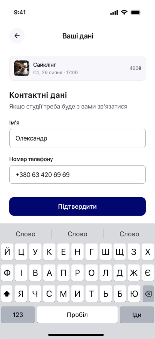
“Why do you need my date of birth, photo and phone number? I just want to find the right training.”
“It's hard to understand how the points work. Why would I buy a package?”
Prioritisation
Nine hypotheses, scored down to three.
Research pointed at three places: personalisation, discovery, and friction before the first booking.
Each opportunity was written as a product hypothesis and scored with ICE – impact × confidence × ease – so the argument for what we built first sat on the table rather than in somebody's head.
| # | Hypothesis | Impact | Conf. | Ease | Score | ICE |
|---|---|---|---|---|---|---|
| 01 | Personalised onboarding | 10 | 10 | 9 | 900 | |
| 02 | Faster training search | 10 | 10 | 7 | 700 | |
| 03 | Progressive account creation | 7 | 9 | 10 | 630 | |
| 04 | Trainer filters on Home | 6 | 9 | 8 | 432 | |
| 05 | Participant count on group classes | 7 | 6 | 9 | 378 | |
| 06 | Review prompt after a workout | 6 | 7 | 8 | 336 | |
| 07 | Cancellation policy on a first booking | 6 | 7 | 8 | 336 | |
| 08 | Trainer ratings and reviews | 5 | 5 | 8 | 200 | |
| 09 | Referral offer after the first booking | 5 | 4 | 5 | 100 |
All three winners sat in the first two minutes of the app. That is the part of the funnel the client was losing, so that is the part we designed.
Hypothesis 01
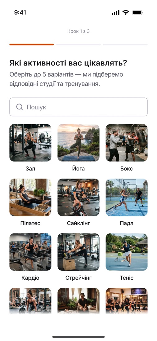
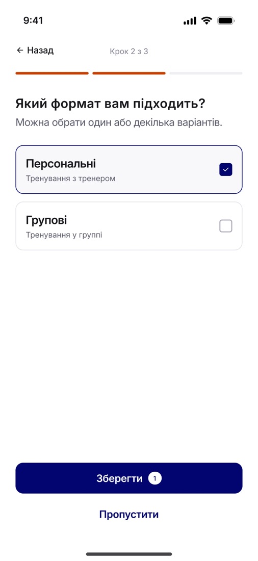
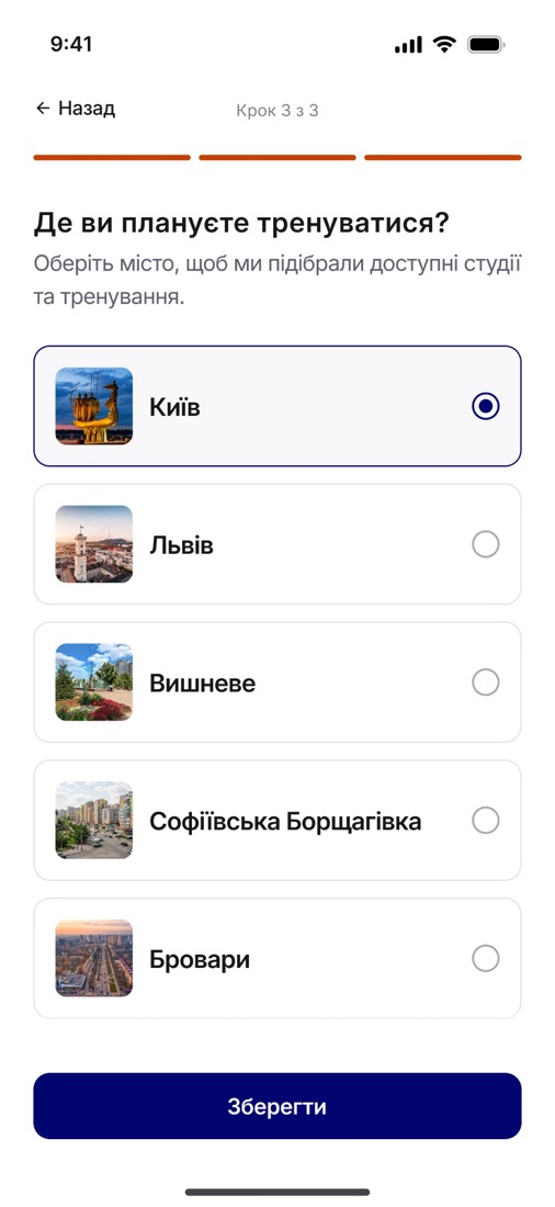
Personalised onboarding
Onboarding asked for a photo and a birthday, then dropped everyone on the same catalogue.
People had strong, different preferences around activities, formats and location – and the app asked for none of them.
Cut onboarding to the three criteria that decide what a person sees: activities, training format, city. The answers define Home, so personalisation is felt rather than promised.
Onboarding completion of 60–80%, the benchmark range for sports and fitness apps.
Hypothesis 02
Faster training search
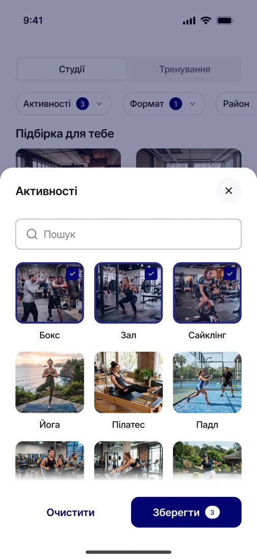
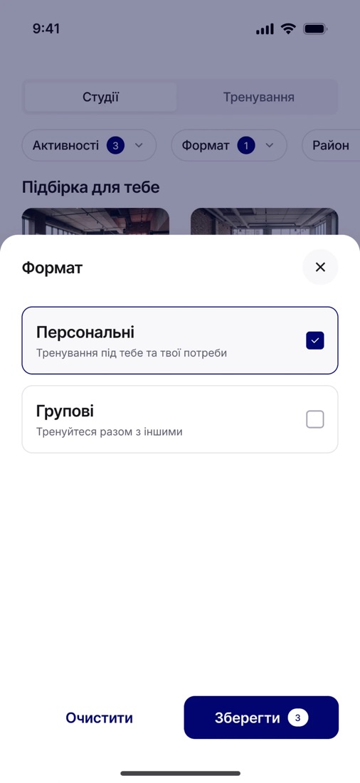
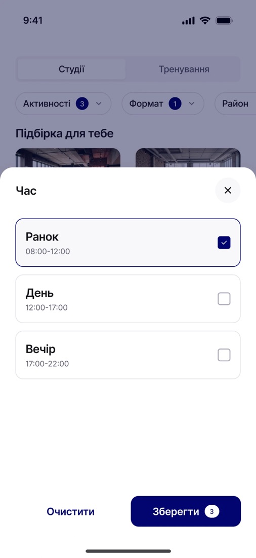
Activity→Format→District→Time→Amenities
Almost nobody started from a studio name. People narrowed down by practical criteria – in that order.
The app kept three parallel sections for one task, and nothing showed what was already filtered. People re-read the same cards looking for the difference.
Put the criteria on Home as chip filters with a visible count of active conditions. Preferences are set once and last; filters are temporary – mixing the two was the original mistake.
Training view → first booking moving from 2% towards 15%, with filter usage as the leading indicator.
Hypothesis 03
Progressive account creation
“Why do you need my date of birth, photo and phone number? I just want to find the right training.”
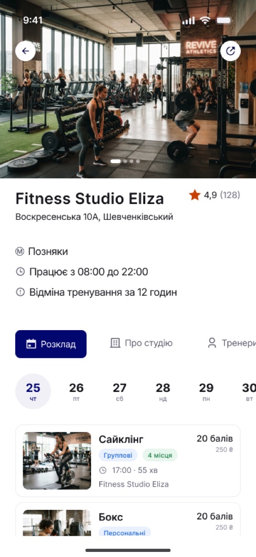
A photo, a date of birth and a verified phone number were asked for before anyone had seen what FitNow is worth.
Move phone verification to the first booking. The account is created quietly alongside the code, and the flow continues into the same booking – so the intent survives the registration.
Install → first booking from 2% to 15%, with the drop-off before the booking stage gone.
UX test
A moderated UX test, run on a platform built for it.
The goal was not to catch usability bugs. It was to find where the new flow still failed to support a decision – which only shows up if you are sitting there while somebody makes it.
Every session was moderated and run end to end on a testing service I built for this app – the task on the left, the prototype live on the right, a timer per participant. Sessions were scored on comprehension, navigation, decision-making, discovery and booking friction.
The six tasks
- Complete the personalised onboarding
- Find relevant training using the filters
- Explore a studio and a training session
- Understand the subscription and the points
- Complete a first booking
What testing changed
Three things came back in every session: points clarity, Home navigation and the value of the subscription. People needed more context to decide – not more screens.
Finding 01 – points needed context
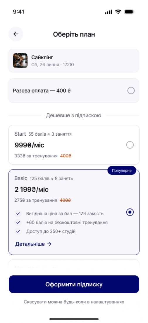
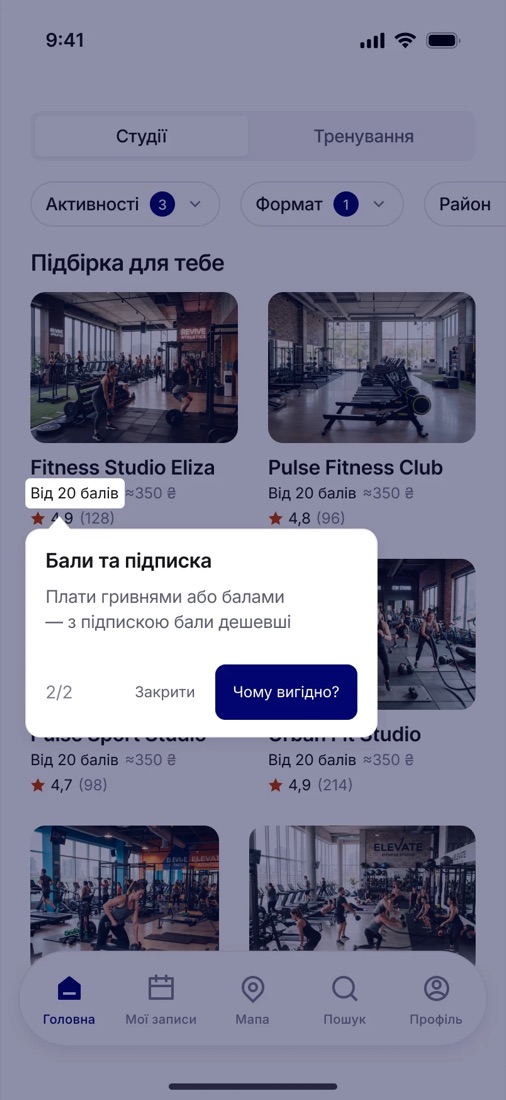
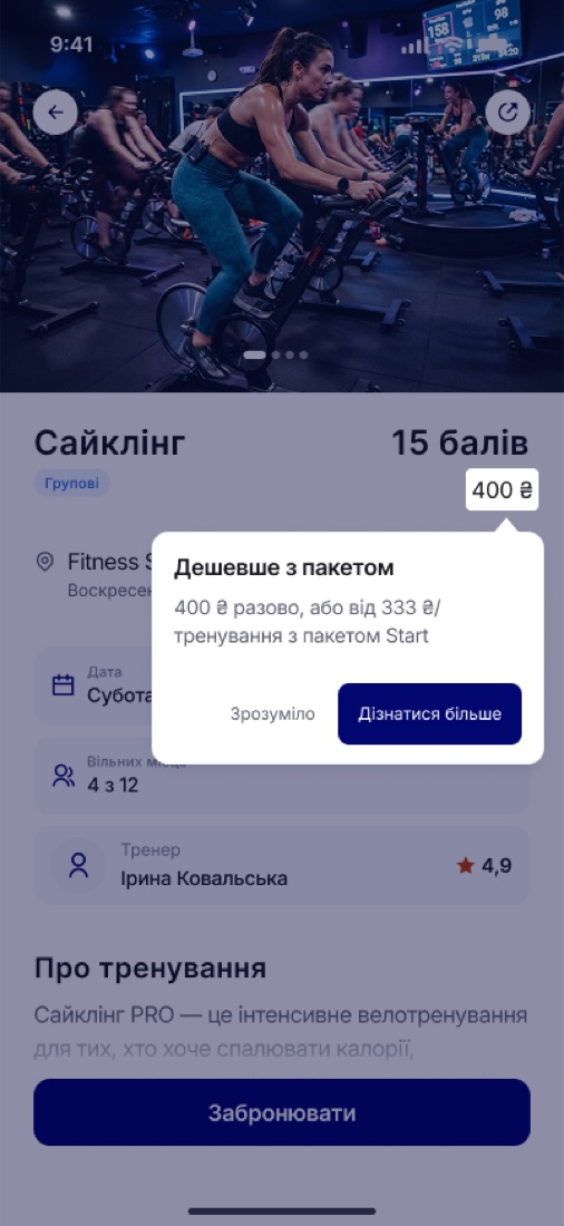
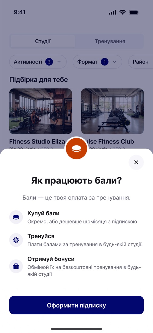
Users did not immediately understand what a point was worth, or how points could be spent on training.
Explain points where people meet them – a contextual tooltip on the training card, priced in both points and hryvnia.
Finding 02 – Home navigation
To be written up from the session notes.
To be written up from the session notes.
Finding 03 – the subscription had to argue for itself
All five participants got through the rebuilt flow and stalled in the same place: the points-and-package model. It was the one barrier left once the earlier steps were simplified.
Prices shown per workout next to the points, with the package framed by what it saves. The test proved that is not enough – it goes into the next round rather than being papered over.
Outcome
The first booking, rebuilt around motivation instead of registration.
Onboarding asks three questions and uses the answers. Home carries the criteria people actually search by. Registration waits until there is something worth registering for. The prototype is public and runnable – six scenarios, a timer and a summary at the end.
The client has since moved in the same direction as the hardest finding of the test: away from the points currency, towards prices in hryvnia and a reworked subscription. Not our design shipped line for line – but the same conclusion.
Next: track Install → First Booking, onboarding completion and filter usage – then go back to the subscription screen.
What we'd measure after activation
Repeat bookings
One booking is not success – the pass has to become a habit.
4 workouts a month
The floor we treat as real retention.
Subscription conversion
Share of users activating a monthly package.
Cost per activated user
Not per install – per person who actually starts.
Studio fill rate
A booking counts for a partner only when somebody shows up.
Drop-off by step
Where the friction sits once the obvious friction is gone.
Ownership
I built the testing service our own app was tested on.
Rather than bend the test to fit a tool, I built the tool around the test: a service made for exactly one app, holding nothing a session does not need.
Maze never got seriously considered: paid, no moderated mode, and no real join with the prototype. Watching the decision happen was the entire point, and that is the one thing those tools do not do.
Run six tasks in order, brief the participant before each one, keep the prototype live beside the task, and time each run – so five sessions could be compared instead of recalled.
No accounts, no panel recruiting, no heat maps, no dashboards. Every feature that did not serve the next forty minutes was cut, because in a moderated session anything extra competes for the moderator's attention.
How a session ran on it
- A brief opens the task: the situation, what to do, and a reminder to think aloud. The timer starts only when the participant presses start – reading time is not reaction time.
- They work a real scenario in the prototype beside the task, free to wander, skip the task or restart it from the beginning.
- I watch and note where the hesitation sits, against the five criteria rather than against my own expectations.
- Each task closes with its own confirmation before the next brief opens, so five sessions compare as five runs of one test rather than five conversations.
The prototype runs as a real scenario, branching where the product branches – not as a straight line of frames.
That is the part a generic tool could not give us, and the reason the findings hold: people met the product the way it actually behaves. I built it front to back myself, with Claude Code – and the same portal now holds the research, the presentations and the live prototype in one place.
Next